
Chicago’s Union Station: Much Ado About an Addition
July 11, 2018 Lots of Chicago architects are up in arms over the new design for an addition to Union Station, and I’m sure they all think they can do better.
Maybe. But probably not much better.
Solomon Cordwell Buenz late last month delivered a plan for a modern seven-story glassy addition to perch atop the gray eminence of the 1925 station. It actually lops a bit over the top of the upper stories of the current building, perhaps to squeeze sufficient space for 404 apartments. Detractors say it looks incongruous and disrespectful.
The criticism comes after a long history of assaults on this Daniel Burnham-designed landmark, including the destruction of the Grand Concourse to make way for an extremely forgettable office building, 222 S. Riverside Plaza, built in 1971. Architects and engineers were eventually sorry that vanilla tower was there, because they needed the access to more tracks that it impeded, as Amtrak and Metra service burgeoned.
So it goes.
The planned station addition has a hole through the middle to let light into the station’s famous Great Hall. But that can only be seen from above. From any other angle, it’s just another glassy box in a downtown populated by glassy boxes.
In addition to the apartment structure, the upcoming Union Station redevelopment includes conversion of the existing upper stories of the station from offices to 330 hotel rooms. A nearby garage is to be razed to allow the construction of an office building.
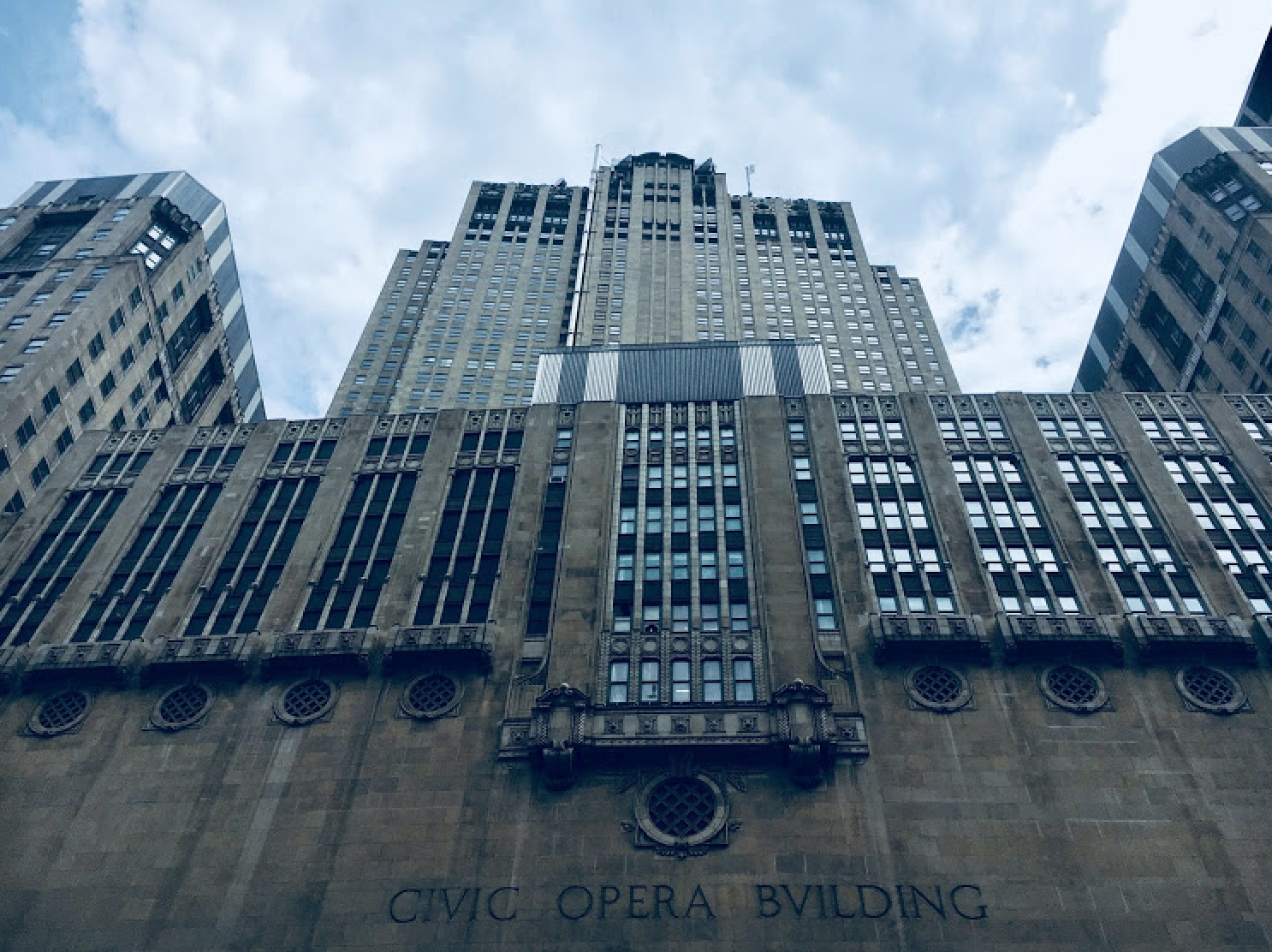
Just because a building is tall doesn’t mean it has to be boxy and boring. (Irv Leavitt photo)
As the plans go to the Commission on Chicago Landmarks, they might change considerably to reflect the criticism. Or they might not. There’s a building boom on, and it must be served.
But if the plans are soon different — different how?
Two other relatively recent concepts appeared to show the building basically just growing straight up, granite-sheathed, for a couple of dozen stories. These designs weren’t well-received either, though not panned as enthusiastically. Both visions died of internal injuries, not criticism.
These two schemes, like the new one, suffered from the same design disease that plagues communities from Wacker Drive to Wilmette: every bit of land, and every story, has to be maximized for usable space.
You’d might as well build each story just as big as the story below. It costs less to go sideways than vertically. Build the walls straight up. That’s cheaper, too.
It’s been the rule in the Loop for a long, long time. When there’s an exception, it attracts a lot of attention.
When Graham Anderson Probst & White — the same firm that, as Graham, Burnham & Co., designed the station — built the beautiful Civic Opera Building for Samuel Insull in 1929, people just had to know why it wasn’t monolithic. They found out it was created in the shape of a giant throne for Insull, one of the great robber barons, who was thumbing his nose at some old New York enemies.
If not for his spite, it would be less interesting to look at today, perhaps on the level of some of the newer buildings that surround Union Station now.
Who done it?
Amtrak cut a deal for the most recent exploitation of the Union Station property with Riverside Investment & Development, a big Loop developer, and Convexity, a specialist in historic buildings.
Amtrak is not a government agency. It’s a private company formed by the federal government over 40 years ago. Like all interstate transportation entities, it lobbies hard for federal funding to maintain supportive infrastructure. Unlike airlines, which enjoy big federal spending on airport construction, Amtrak gets its funding directly.
But even if Amtrak was a federal agency — and many people mistakenly believe it is — it would not be immune to the standard way of doing commercial real estate construction in the Loop.
That’s why, for instance, the Kluczynski Federal Building is a big black box. We’re all grateful that it has a plaza in front of it. But it has always seemed to me that the plaza is not designed for people, but is an ideal place for monkeys to hang out in.
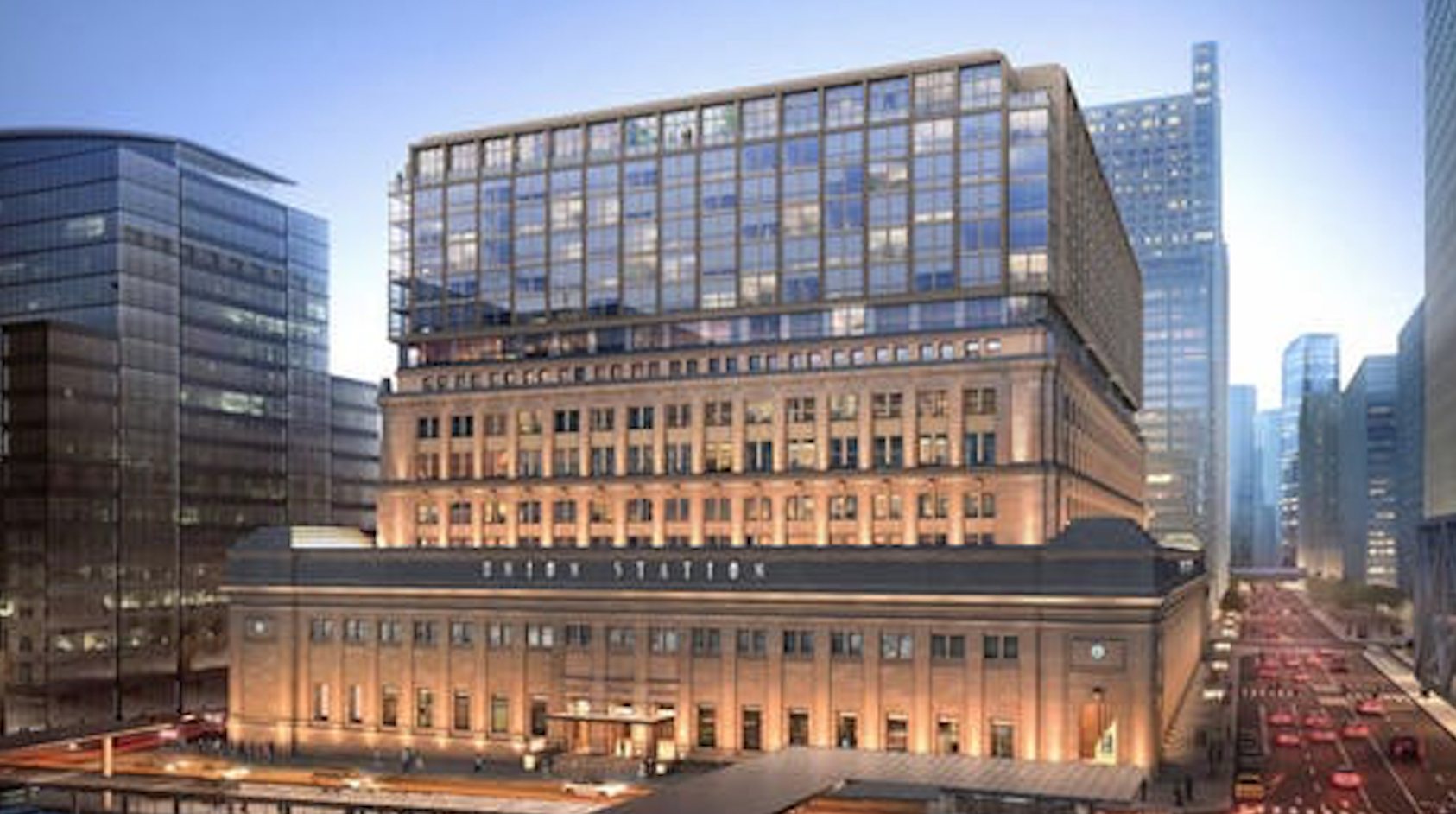
The much-criticized new design of an addition to Chicago’s Union Station. (Solomon Cordwell Buenz photo-illustration)
I just find the building gigantically reminiscent of the black monolith the chimpanzees were throwing bones at in the first scene of “2001: A Space Odyssey.” The movie was confusing people at the Cinestage Theatre, then a couple of blocks to the north, while Big Klu was being built.
The federal plaza replaced the Chicago Federal Building, built in 1905 and demolished in 1965. Its loss is one of the most lamented by architects in a city notorious, they say, for razing landmarks before their time.
That old building covered a square block, and had a wider dome than the Capitol Dome in Washington. Yet it didn’t block the view of everything behind it.
That’s because its upper levels were built in the form of a cross, with the dome in the center. From the sidewalk, looking up above the third floor, you could only see the dome and one end of the cross.
So from every direction, it looked majestic — and a little scary — but not overwhelming.
It was a memorable building. Al Capone was convicted in one of the courtrooms, and Kenesaw Mountain Landis presided there. For years, it was the city’s main post office, too.
Building backwards
The gabled and columned top floors of that old federal building could be resized and rebuilt fairly faithfully atop Union Station, miraculously resurrecting that grieved-over old courthouse as a crown for a survivor of the same era.
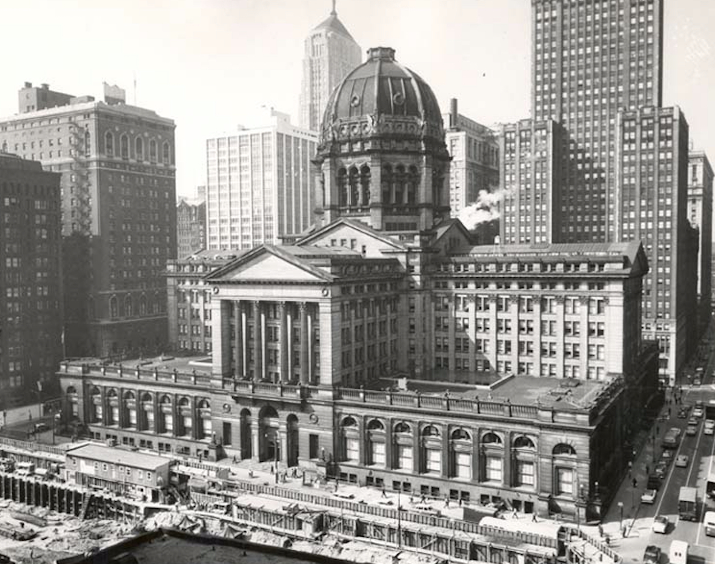
The same architectural firm that designed Union Station also designed the long-ago-demolished old Chicago Federal Building. (U.S. Government photo)
But modern architects, including devoted preservation and restoration fans, are unlikely to design anything with so much Gothic frou-frou. And even with a more modern façade, it ain’t happening. The design leaves untouched considerable buildable space between the wings. That just isn’t done.
Oddly, the current Union Station addition plan has one similarity to the old Federal Building. Viewed from the sidewalk, the new addition would not only look smaller than it was — it would virtually disappear.
It would blend in with the taller, relatively nondescript steel and glass towers all around it.
If black, it would look something like, for instance, the Kluczynski Federal Building, a few blocks away. Some architects like that building a lot more than the old federal building.
The newer federal building was designed by Ludwig Mies van der Rohe. Mies became a much-respected artist for innovating the design of structures that were, as he called them, “skin and bones.”
It caught on.
It became fashionable and artistic to build big buildings with basic designs that a third grader could create with a primary pencil and a lunch bag.
Mies wasn’t — at least at the beginning — trying to help Chicago builders get more bang for their buck. He was just a college professor who liked the idea of skyscrapers that looked like big cereal boxes, only less fun to stare at in the morning.
The buildings’ innards were nice and rectangular, so office leasers could eternally switch everything around in attempts to squeeze more work out of their employees.
Glassy boxes enclosing offices, condos and apartments now dominate downtown Chicago.
So what’s everybody complaining about at Union Station?
They got what they like. They got what they make.
Get your free subscription of the Cook County digital edition
— Chicago’s Union Station: Much Ado About an Addition —-
Trending News
 Two killed in Eden Expressway ...Two people were killed in accidents on the Edens Expressway. A three-unit ...
 Woman charged with killing boy ...A Chicago woman has been charged with murder in connection with the ...
 With scant notice, Rockford hospital ...Residents on Rockford’s west side are feeling abandoned and betrayed after Javon ...
 Highland Park parade ‘full of ...Highland Park’s Fourth of July events included a parade which stepped off ...